Free Color Palette Generator - Create Beautiful Color Schemes
What Is a Color Palette Generator?
A color palette generator is a tool that creates harmonious sets of colors based on color theory principles. Instead of manually picking shades that work together, you simply choose a base color and a harmony type — and the tool does the matching for you. This is useful for web designers, brand designers, illustrators, developers, and anyone building a visual project who needs colors that look good together.
This tool generates palettes of 2–8 colors using rules like complementary, analogous, triadic, and monochromatic harmony. You can also extract a palette directly from a photo, lock colors you like and regenerate the rest, and export your result as CSS variables, HEX codes, or RGB values.
How to Generate a Color Palette
Using this tool takes under a minute:
- Choose a harmony type – Pick from complementary, analogous, triadic, split-complementary, monochromatic, or tetradic.
- Set your base color – Use the color picker to select your starting hue, or enter a HEX code directly.
- Choose how many colors – Slide between 2 and 8 swatches.
- Hit Generate – Or press Space on your keyboard for instant results.
- Lock what you love – Click the lock icon on any swatch to keep it while regenerating the rest.
- Export – Copy as CSS variables, HEX list, or RGB values with one click.
Tip: You can also drag and drop any image onto the tool to extract its dominant colors automatically.
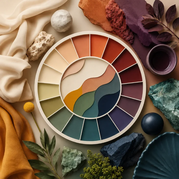
Color Harmony Types Explained
Understanding harmony types helps you pick the right one for your project. Here’s a quick breakdown:
01
Complementary Colors
02
Analogous Colors
03
Triadic Colors
04
Split-Complementary Colors
05
Monochromatic Colors
06
Tetradic (Square) Colors
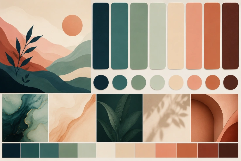
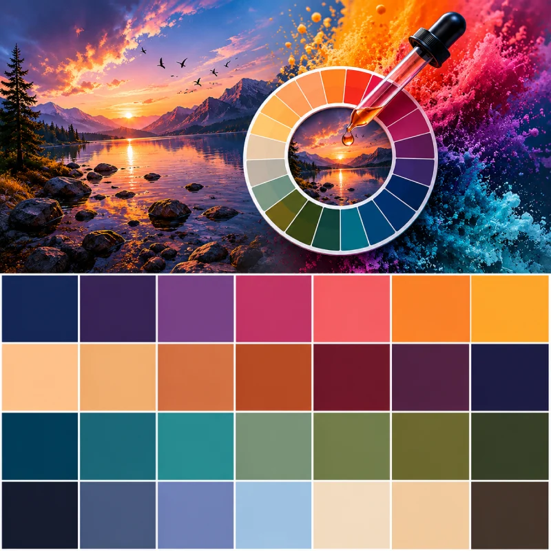
Extract a Color Palette from Any Image
One of the most useful features here is color extraction from images. Upload a photo — a brand mood board, a product photo, a landscape — and the tool samples thousands of pixels using a k-means clustering algorithm to find the most dominant, visually significant colors.
This is useful when you:
- Want a website palette that matches a hero photo
- Need to match brand colors from a logo file
- Are designing packaging and want the colors to echo the product’s photography
- Want to build a design system inspired by a reference image
Just click the image upload area, or drag and drop any JPEG or PNG directly onto the tool.
Explore More Free Tools
Frequently Asked Questions
Is this color palette generator free to use?
Yes, completely free — no account required, no limits on how many palettes you generate.
What color formats can I export?
You can copy your palette as CSS variables (--color-1: #hex), a plain HEX list, or RGB values. One click copies everything to your clipboard.
Can I generate a palette from a photo?
Yes. Click the image upload area or drag and drop a JPEG or PNG. The tool uses k-means color clustering to extract the most dominant colors from your image — the same technique used by professional design tools.
How many colors can I generate in one palette?
Between 2 and 8 colors. Use the color count selector in the controls bar to adjust.
What is a complementary color scheme?
A complementary scheme pairs two colors that sit directly opposite each other on the color wheel, like blue and orange or red and green. They create high contrast and strong visual energy — ideal for designs that need to stand out.
What's the difference between analogous and monochromatic palettes?
Analogous palettes use colors that are neighbors on the color wheel (like blue, blue-green, and green), giving you a range of related hues. Monochromatic palettes stick to one single hue but vary its lightness and saturation — resulting in a more unified, minimal look.
Can I lock a color and generate new ones around it?
Yes. Hover over any swatch and click the lock icon. Locked colors stay fixed when you click Generate or press Space — the tool only regenerates the unlocked swatches.
Do my saved palettes persist after I close the browser?
Yes. Saved palettes are stored in your browser's local storage and will be there when you return, as long as you don't clear your browser data.
What is color harmony?
Color harmony is the principle of combining colors in a way that is visually pleasing and balanced. Harmony types — like complementary, triadic, or analogous — are rules derived from the color wheel that describe which color combinations naturally work well together.
What's the best color palette for a website?
It depends on your brand and audience. A monochromatic palette works well for minimal, sophisticated sites. Analogous palettes feel natural and calming. Complementary schemes are bold and high-contrast. A common approach is to choose a primary brand color, then use the generator to find matching accent and background shades.