
CSS Button Hover Effects
Fill sweep
A solid fill slides in; a second label is revealed with the exact same motion so it can't mismatch.
Border draw-in
The outline traces itself on hover, like it's being drawn with a pen.
Magnetic pull
The button nudges toward your cursor as it gets close.
Press ripple
A click effect — a ripple expands from the exact point you click.
Shine sweep
A thin diagonal light streak sweeps across the button on hover — subtle, premium SaaS feel.
Rotating gradient border
A conic gradient ring spins gently around the border on hover — the Vercel/Linear style glow.
Arrow slide-in
An arrow icon slides in from nowhere as you hover, no layout jump.
3D press
Tactile depth — the button sinks toward its shadow on hover and fully on click.
Gradient shift
A two-tone gradient slides across the button on hover.
Letter-spacing expand
Tracking widens on hover — minimal, editorial, very premium in all-caps labels.
Icon rotate
The trailing icon spins 180° on hover.
Corner brackets
Camera-viewfinder-style corner marks snap into place around the label.
Vertical text swap
The label slides up and out as a second label slides in behind it.
Shadow lift
Simple, clean elevation — the button lifts and its shadow grows.
Circle reveal
A dot at the center expands into a full fill, like an iris opening.
Neon pulse border
A soft glow breathes around the border on hover.
Diagonal corner wipe
A colored triangle slides in from the corner as a quiet accent.
Double border snap
A second outline appears just outside the button and snaps in closer on hover.
Underline focus
A borderless text button — an underline grows outward from the center.
Icon bounce
A download icon bobs gently while hovered.
Split door reveal
Two panels slide apart like elevator doors, revealing the label underneath.
Glitch text
Chromatic-aberration copies flicker behind the label for a quick digital-glitch hit.
3D flip swap
The whole button flips on its X-axis to reveal a second label on the back face.
Skew squeeze
A quick italic-style skew on the whole button, with the label counter-skewed to stay readable.
Color invert
A borderline-simple classic — fill and text colors swap instantly on hover.
Rotating dashed frame
A dashed outline fades in and slowly turns around the button — a lighter cousin of the glow ring.
Icon crossfade swap
A trailing icon crossfades into a different one on hover — arrow becomes checkmark.
Text scramble
The label decodes itself from random characters into the real text on hover.
Corner peel
A small paper-like corner lifts off the bottom-right edge, like a page about to turn.
Confetti burst
A click effect — small colored pieces burst outward from the button and fade away.
CSS Card Hover Effects
Spotlight card
A soft light follows the cursor inside the card border.
Tilt card
The card tilts a few degrees toward the cursor.
Pro plan
$12 / month
Glass card
Frosted glass surface that lifts and brightens on hover.
Field notes
5 min read
Caption reveal card
The caption sits mostly hidden below the fold and slides fully into view on hover.
Starter
Free forever
Border trace glow
The same rotating gradient ring as the button glow, applied to a pricing card.
Team
$29/mo per seat
Elevate lift
The plainest, most reusable one — a clean rise with a soft shadow.
CSS Link & Menu Hover Effects
Sliding pill nav
A soft pill glides between nav items as you move between them.
Double underline grow
A thin static base line, plus an accent line that grows in over it.
Color wipe text
The same synced dual-label technique as the fill-sweep button, applied to plain text.
Vertical accent bar
Sidebar/docs-nav style — a bar grows in on the left edge of the link.
Micro scale
The smallest possible move — a tiny scale and color shift. Good for dense lists.
Fill pill
A dark pill slides up from the bottom to fill behind the label, text turning white.
Strike-through draw
A line draws itself across the text on hover — handy for 'mark done' or crossed-out pricing.
Text glow
The label turns accent-blue and picks up a soft glow — good for dark-background nav.
Bracket slide-in
[ Brackets ] slide outward from behind the text, framing it on hover.
Gradient sweep text
An animated gradient sweeps across the label, clipped to the text shape.
Offset shadow copy
A ghost copy of the text appears offset behind it, and both nudge apart on hover.
Thick bar from center
A bold accent bar grows outward from the center rather than sliding from one side.
Arrow + underline combo
A trailing arrow slides in at the same time an underline appears — two cues, one motion.
3D tilt lift
A subtle perspective tilt and lift on hover — feels tactile without any JS.
Subtitle reveal
A small descriptive line unfolds below the label — great for nav items that need context.
CSS Image Hover Effects
Duotone reveal
Sits muted and grayscale by default, turns to full color with a slight zoom on hover.
Zoom crop
The image scales up inside a fixed, clipped frame — classic gallery zoom.
Frame reveal
The photo sits inset inside a border frame, then expands to fill it on hover.
Diagonal wipe
A second image wipes in diagonally from the bottom-left corner.
CSS Icon Hover Effects
Full spin
The icon rotates a full 360° on hover.
Heartbeat pulse
The icon pulses in size while hovered, like a heartbeat.
Attention shake
A quick wiggle to draw the eye — good for notification bells.
Y-axis flip
The icon flips over its vertical axis on hover.
Ring fill
A colored circle expands to fill the box, and the icon turns white.
Float + shadow
The icon box rises and its shadow deepens, like a lift button.
Color + glow
The icon turns accent-blue and picks up a soft drop-shadow glow.
3D perspective tilt
The whole box tilts in 3D space toward the corner on hover.
CSS Social Media Hover Effects
CSS 3D & Special Hover Effects
Rotating cube reveal
A true 3D cube — hover turns it 90° on its Y-axis to show a second face.
Liquid blob morph
An organic border-radius shape that morphs into a different blob on hover.
Hover-to-scroll marquee
Text sits still until hovered, then scrolls continuously like a ticker.
Full cube spin (6 faces)
A real six-sided cube — front, back, left, right, top, and bottom — that keeps tumbling continuously in 3D while hovered, showing every face in turn.
What Are CSS Hover Effects?
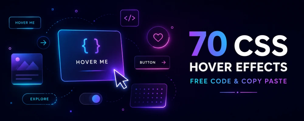
CSS hover effects are visual changes triggered when a user moves their mouse over an element – a button, link, image, or icon. Using the :hover pseudo-class along with transition or animation, you can create effects like color changes, sliding underlines, fill animations, 3D flips, and glowing borders – all without JavaScript.
They’re used across websites to make buttons feel clickable, guide attention to important links, and add a bit of polish to otherwise static UI elements.
Why Use Pure CSS Hover Effects Instead of JavaScript?
- Faster page load — no extra JS libraries or dependencies
- Better performance — CSS transitions run on the GPU and stay smooth
- Easier to maintain — a few lines of CSS instead of event listeners and DOM manipulation
- Works everywhere — no framework lock-in, drops into any HTML page or WordPress theme
How to Use These Hover Effects on Your Website
- Pick an effect from the preview above and click the HTML and CSS tabs
- Copy both snippets using the Copy button
- Paste the HTML where you want the button, link, or icon to appear
- Paste the CSS into your stylesheet (or Elementor’s Custom CSS box)
- Adjust colors, size, and text to match your site’s branding
Most effects use CSS variables for color, so you only need to change one or two values to match your brand instead of rewriting the whole rule.
Frequently Asked Questions
Do these hover effects work on mobile?
Hover effects rely on a mouse pointer, so they won't trigger on touch devices by default. For mobile, pair them with a :focus or :active state, or trigger the effect on tap using a small script.
Will these effects slow down my website?
No — every effect here uses CSS transition or animation, which browsers handle efficiently. There's no added JavaScript overhead unless the effect specifically needs it (like the confetti burst or text scramble).
Can I use these effects with WordPress and Elementor?
Yes. Paste the CSS into Elementor's Custom CSS panel (or your theme's additional CSS), and add the HTML using an HTML widget or your theme's template files.
Do I need any external library to use these?
No. Every effect is pure CSS (with two small vanilla-JS exceptions — text scramble and confetti burst, both included and copy-paste ready).