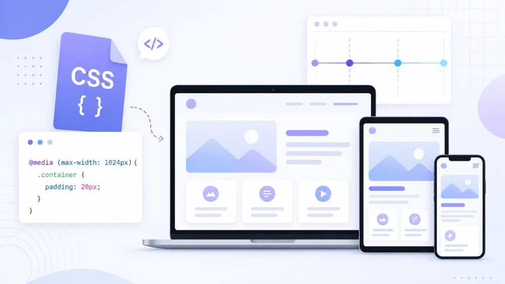

CSS media queries are an excellent way of changing your CSS for any device, tablet, or smartphone to create a better user experience and look of your website. Media queries can target your CSS for different screen sizes, orientations, and/or resolutions so that your content is easily readable while ensuring that user layouts are maintained between screens such as desktops tablets and smartphones.
🎨
filename.css
/* Small Phones */
@media only screen and (max-width: 480px) {
}

/* Phones / Mobile */
@media only screen and (min-width: 481px) and (max-width: 767px) {
}

/*for all mobile*/
@media only screen and (max-width:767px) {}

/* Mobile Landscape */
@media only screen and (max-width: 767px) and (orientation: landscape) {
}

/* Tablet Portrait */
@media only screen and (min-width: 768px) and (max-width: 1024px) {
}

/* Tablet Landscape */
@media only screen and (min-width: 768px) and (max-width: 1024px) and (orientation: landscape) {
}

/* Small Laptop */
@media only screen and (min-width: 1025px) and (max-width: 1199px) {
}

/* Desktop */
@media only screen and (min-width: 1200px) and (max-width: 1439px) {
}

/* Large Desktop */
@media only screen and (min-width: 1440px) {
}
Why Media Queries are Important:
- Better UX: Change your designs, fonts, and so on so your website not only looks like but also acts well on every device user.
- Better Performance: Load all styles or resources for every device, on every device.
- Efficiency: One responsive website is now the only, and effective, version instead of mobile and desktop sites.
Conclusion:
Using media queries are paramount for modern web design. This will make your website responsive, mobile friendly, and good looking in a responsive design and drastically improve both the user experience as well as the overall performance of your site.