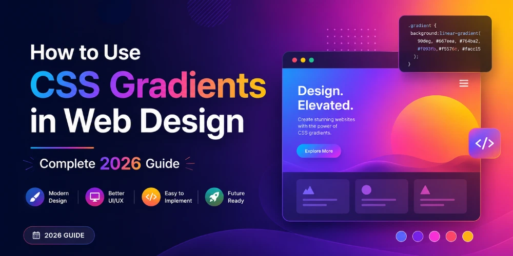

If you are designing websites in 2026, gradients are no longer optional. Mesh gradients, glassmorphism overlays, gradient text, and animated backgrounds are everywhere – from SaaS dashboards to personal portfolios. The flat design era is well and truly over.
The good news is that modern CSS handles all of this natively. No Photoshop exports, no image files, no extra HTTP requests. Just a few lines of CSS that look sharp on every screen.
In this guide you will learn the three core CSS gradient types, advanced techniques designers are using right now, common mistakes to avoid, and how to generate production-ready gradient code in seconds using a free tool.
The 3 Types of CSS Gradients
1. Linear Gradient
The most used gradient type. Colors transition in a straight line at any angle you choose. Perfect for hero sections, buttons, and navigation bars.
background: linear-gradient(135deg, #667eea, #764ba2);Direction options:
- to right - left to right
- to bottom - top to bottom (default)
- 45deg, 90deg, 135deg - precise angle control
Multiple color stops:
background: linear-gradient(to right, #f7971e, #ffd200, #21d4fd);2. Radial gradient
Colors radiate outward from a center point. Great for spotlight effects, glowing buttons, and vignettes.
background: radial-gradient(circle at 30% 70%, #a1c4fd, #c2e9fb);Common uses:
- Soft inner glow on cards
- Vignette on full-page backgrounds
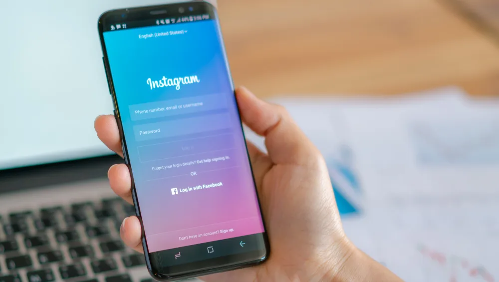
- Instagram-style icon gradients
3. Conic gradient
Colors sweep around a center point like clock hands. Supported in all modern browsers since 2021. Ideal for pie charts and color wheels in pure CSS.
background: conic-gradient(#4f46e5 0% 40%, #e5e7eb 40% 100%);
border-radius: 50%;
Advanced Gradient Techniques Designers Use in 2026
Gradient Text
One of the most searched gradient techniques right now. Makes headings pop without loading a single image.
h1 {
  background: linear-gradient(135deg, #667eea, #764ba2);
  -webkit-background-clip: text;
  -webkit-text-fill-color: transparent;
  background-clip: text;
}
Works in all modern browsers. Use sparingly – best on large headings, not body text.
Gradient Borders
A subtle but powerful technique for cards, buttons, and dividers.
border: 3px solid transparent;
background: linear-gradient(white, white) padding-box,
            linear-gradient(135deg, #667eea, #764ba2) border-box;
Or the simpler shorthand:
border-image: linear-gradient(45deg, #667eea, #764ba2) 1;Glassmorphism with Gradients
The biggest UI trend of 2026. Combines a semi-transparent gradient overlay with backdrop blur to create a frosted glass effect. Works best over vivid gradient backgrounds.
/* Background layer */
background: linear-gradient(135deg, #667eea, #764ba2);

/* Glass card on top */
.glass-card {
  background: linear-gradient(135deg, rgba(255,255,255,0.1), rgba(255,255,255,0.05));
  backdrop-filter: blur(10px);
  border: 1px solid rgba(255,255,255,0.18);
  border-radius: 16px;
}
Performance note: backdrop-filter is GPU intensive. Only apply it to a small number of elements per page. Test on older Android devices before deploying.
Animated Gradient Background
Static gradients are being replaced by slow-moving animated ones. The trick is to animate background-position on an oversized gradient rather than animating colors directly (which CSS transitions cannot do).
.animated-bg {
  background: linear-gradient(270deg, #667eea, #764ba2, #f5576c, #ffd200);
  background-size: 400% 400%;
  animation: gradientShift 8s ease infinite;
}

@keyframes gradientShift {
  0%   { background-position: 0% 50%; }
  50%  { background-position: 100% 50%; }
  100% { background-position: 0% 50%; }
}
Use this on hero sections. Keep the animation slow – 6 to 10 seconds per cycle feels natural and avoids motion sickness.
5 Ready-to-Use Gradient Recipes
Soft Purple Hero:
background: linear-gradient(135deg, #667eea 0%, #764ba2 100%);Warm Sunset Button:
background: linear-gradient(to right, #f7971e, #ffd200);Cool Blue Section:
background: linear-gradient(to bottom, #2193b0, #6dd5ed);Subtle Card Background:
background: linear-gradient(to bottom right, #f8f9fa, #e9ecef);Dark Mode Depth:
background: linear-gradient(180deg, #1a1a2e 0%, #16213e 50%, #0f3460 100%);Common Mistakes to Avoid
Text on Gradients Without Contrast Check: A gradient that starts dark enough for white text may transition to a light area where white text becomes unreadable. Always test contrast across the full gradient range. Add a semi-transparent dark overlay if needed:
background: rgba(0, 0, 0, 0.4);Too Many Color Stops: More than 5 color stops looks noisy and hurts rendering on low-end mobile devices. Keep it simple – 2 to 4 stops is almost always enough.
Using Gradient on Every Element: Gradients lose their impact when overused. Pick 1 or 2 focal elements per page – hero section, CTA button, or key card. Leave everything else flat.
Forgetting Banding on Budget Monitors: Some cheap displays show visible stripes in gradients. Using subtle mid-stop colors and adding slight noise via SVG filter can prevent this on problematic screens.
Stop Writing Gradient Code by Hand
Writing gradient CSS manually is fine for simple two-color transitions. But when you are experimenting with angles, multiple stops, and advanced effects, doing it by hand eats time.
The free CSS Gradient Generator on HS Article lets you build linear and radial gradients visually with a live preview, then copy production-ready CSS in one click. No signup, no watermarks.
Browser Support
- linear-gradient and radial-gradient – all browsers including IE10+
- conic-gradient – all modern browsers since 2021 (Chrome 69+, Firefox 83+, Safari 12.1+)
- No vendor prefixes needed in any browser released after 2015
For legacy support, add a solid color fallback before the gradient:
background: #667eea;
background: linear-gradient(135deg, #667eea, #764ba2);
Frequently Asked Questions
What is the difference between linear and radial gradients?
A linear gradient transitions colors in a straight line at an angle you define. A radial gradient radiates outward from a center point. Use linear for backgrounds and banners, radial for spotlight or glow effects.
How do I add gradient to text in CSS?
Use background-clip: text combined with -webkit-text-fill-color: transparent. Apply the gradient as the background of the text element. Works in all modern browsers.
Can I animate a CSS gradient?
Not directly. CSS transitions cannot animate gradient colors. The workaround is to animate background-position on a large gradient using @keyframes, which creates a smooth shifting color effect.
Do CSS gradients work on all browsers?
Linear and radial gradients work in all browsers including IE10+. Conic gradients work in all modern browsers since 2021. No vendor prefixes are needed for browsers released after 2015.
What is glassmorphism and how do gradients relate to it?
Glassmorphism is a UI trend that creates a frosted glass appearance using semi-transparent backgrounds and backdrop-filter blur. Gradients are the foundation - a vivid gradient sits behind the glass element and shows through the blur, creating depth and color.
How many colors can I use in a CSS gradient?
Technically unlimited. Practically, 2 to 5 color stops produce the best results. Beyond 5, gradients tend to look noisy or cluttered on most screens.
Conclusion
CSS gradients in 2026 are more powerful than ever. From simple two-color linear backgrounds to animated heroes, gradient text, glassmorphism cards, and gradient borders – the possibilities are wide and the code is lightweight.
Master the three core types, experiment with the advanced techniques, and keep your usage intentional. A well-placed gradient does more for your design than ten visual effects stacked together.
Ready to build? Try the free CSS Gradient Generator on HS Article – no signup needed.


