
If you’ve ever copied a font size from Figma, a brand style guide, or a print PDF and pasted it into your CSS only to get a weirdly oversized heading – you’ve run into the pt vs px problem.
Points (pt) are a print unit. Pixels (px) are a screen unit. They’re not the same, and using one when you mean the other is one of those small mistakes that quietly breaks your typography.
This guide breaks down exactly what each unit means, the formula to convert pt to px, when each one makes sense, and where the feet-to-pixels question fits in if you’re working on something like large-format signage or print-to-screen layouts.
What Is a Point (pt) in Typography?
A point is the oldest unit in typography. Before digital design existed, type was set in physical blocks of metal, and the point was how you measured it. One point equals 1/72 of an inch – that’s where the number comes from. There are 72 points in one inch.
You’ll see pt used in:
- Microsoft Word, Google Docs, and most word processors
- Print design software like Adobe InDesign
- PDF specifications
- Email clients (HTML email CSS still commonly uses pt)
- Brand guideline documents that were created for print
The key thing to understand is that pt is an absolute unit tied to physical inches, not to your screen. A 12pt font in a Word document is designed to print at exactly 1/6 of an inch tall on paper.
What Is a Pixel (px) in Web and Screen Design?
A pixel in CSS is a reference unit, not a physical dot on your screen. At the standard browser reference density of 96 DPI, one CSS pixel is defined as 1/96 of an inch.
But here’s where it gets a little interesting: on a Retina or high-DPI screen, one CSS pixel might map to two or four physical hardware pixels. The browser handles that translation automatically. So when you write font-size: 16px in CSS, you’re specifying a CSS pixel — not a hardware pixel — and the device figures out how to render it.
You’ll use px for:
- Font sizes in CSS (though rem is often a better choice)
- Border widths, spacing, padding
- Fixed-size UI elements
- Image dimensions on screen
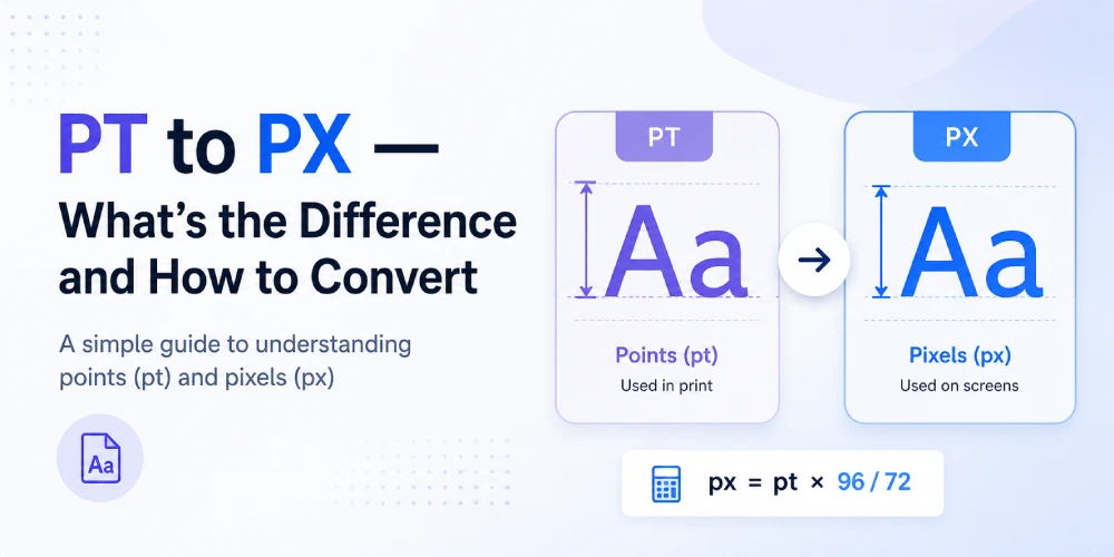
The PT to PX Formula (and Why It Works)
Here’s the conversion: px = pt × 1.3333
Or if you want to go the other way: pt = px ÷ 1.3333
Why 1.3333? Because:
- 1 inch = 72 points
- 1 inch = 96 pixels (at standard screen 96 DPI)
- So: 96 ÷ 72 = 1.3333
That ratio is fixed for CSS rendering, regardless of what physical screen you’re on. Your browser assumes 96 CSS pixels per inch when converting pt values, so the math is always the same.
Some common conversions to have handy:
| Points (pt) | Pixels (px) | Where you'll see it |
|---|---|---|
| 9pt | 12px | Small body copy |
| 10pt | 13.33px | Print body text |
| 11pt | 14.67px | Comfortable reading |
| 12pt | 16px | Standard body / browser default |
| 14pt | 18.67px | Subheadings |
| 18pt | 24px | H3 headings |
| 24pt | 32px | H2 headings |
| 36pt | 48px | H1 / hero headings |
| 72pt | 96px | Large display text |
The 12pt = 16px relationship is worth knowing by heart. It’s not a coincidence – browser default body text was deliberately set at 16px to match 12pt from print, since that’s the standard body size for printed documents.
What Changes at Different DPI Settings?
The formula above assumes 96 DPI – the web standard. But if you’re converting for print at 72 DPI (the old Mac standard), or for a high-DPI print output, the math shifts:
| Context | DPI | Formula | 12pt example |
|---|---|---|---|
| Screen / CSS (standard) | 96 DPI | px = pt × 1.333 | 16px |
| Print at 72 DPI | 72 DPI | px = pt × 1 | 12px |
| Retina / 2x display | 192 DPI | px = pt × 2.667 | 32px |
For web work, you’ll almost always use 96 DPI. You can use the pt to px converter on this site to handle the calculation quickly without doing the math manually.
PT vs PX - Which Should You Use in CSS?
This is where a lot of designers get confused after they’ve learned the conversion.
Short answer: use px (or rem) in CSS, and pt only in print stylesheets.
Here’s why. When a browser encounters font-size: 12pt, it converts it to pixels internally using that 96 DPI formula. You’re adding an extra step for no real benefit. There’s also some older browser inconsistency with how pt renders at non-standard zoom levels.
For screen-based work, stick with:
- px for precise values you don’t want to scale (borders, icons, layout elements)
- rem for typography and spacing that should respect the user’s browser font size setting
- em for component-level scaling where you want sizes relative to the parent element
- pt only in @media print stylesheets or when working with PDF-specific CSS
Why Designers Still Work in Points
If px is better for screens, why do brand guidelines, design handoff documents, and Figma specs sometimes still list pt values?
Mostly because a lot of brand guidelines were originally created for print, and the designers who made them were working in InDesign or Illustrator where pt is the default. When a developer gets that document and sees “body text: 11pt,” they need to convert it before they can use it.
That’s the most common real-world use case for pt to px conversion — you received a spec in points and need the pixel equivalent to write your CSS.
Converting Feet to Pixels - When That Comes Up
If pt-to-px covers the print-to-web conversion, the feet to pixels converter covers a different but related scenario: large-format design.
When you’re creating a banner, billboard, signage, exhibition display, or a large-format print layout that needs to be prepped as a digital file, you might have physical dimensions in feet but need to know the pixel canvas size to set up in Photoshop or Illustrator.
This comes up a lot for:
- Event banners and exhibition stands
- Outdoor signage (where dimensions are naturally given in feet)
- Large canvas prints
- Retail display graphics
- Trade show graphics
The conversion depends on the intended DPI of the output. A standard large-format print might be 72 or 150 DPI, while a high-quality print is 300 DPI. One foot at 300 DPI = 3,600 pixels. At 150 DPI = 1,800 pixels. At 72 DPI = 864 pixels.
Both converters sit in the same category – translating between physical measurement systems and the pixel-based world of digital design.
PT to PX in Email - A Special Case
Email HTML uses a slightly different ruleset than web CSS. Many email clients – especially Outlook – still use a Word-based rendering engine that handles font units differently.
This is actually one situation where designers do sometimes intentionally use pt in HTML emails. Gimmio and other email signature tools often recommend using px for consistency across email clients, but pt persists in older templates because it dates back to when Outlook’s behavior was even more unpredictable.
If you’re building or editing an HTML email template and see pt values, the safest move is to convert them to px for better cross-client consistency.
When to Use REM Instead of PX
Worth mentioning here because this is where a lot of developers land after they learn the pt-to-px conversion: REM is usually the better choice for font sizes in production CSS.
REM (root em) is relative to the root font size of the document – the <html> element. By default, browsers set the root at 16px, which means 1rem = 16px. But if a user has changed their browser’s default font size for accessibility reasons, rem respects that. Px does not.
So the practical workflow is often:
- Get your values from a design spec in pt
- Convert to px to understand the intended size
- Express it in rem for the final CSS
For a 12pt body spec: 12pt → 16px → 1rem. Matches perfectly, which again is why that particular pairing was intentional.
Frequently Asked Questions
What is 12pt in pixels?
12pt equals exactly 16px at the web-standard 96 DPI. This is also the default body text size in most browsers, which is why the two values align so neatly.
Is pt or px better for CSS font sizes?
For web CSS, px is more predictable than pt, but rem is often the best choice because it scales with user browser preferences, which improves accessibility. Use pt only in print-specific stylesheets.
Why does 1pt not equal 1px?
Because the two units are based on different reference measurements. A point is 1/72 of an inch; a pixel is 1/96 of an inch. Since 96 ÷ 72 = 1.333, one point equals 1.333 pixels.
How do I convert pt to px in CSS manually?
Multiply the pt value by 1.3333. So 10pt = 13.33px, 14pt = 18.67px, 18pt = 24px. Or use the pt to px converter tool to skip the math.
What is 11pt in pixels?
11pt converts to approximately 14.67px at 96 DPI.
What's the difference between pt and px in Figma or design tools?
Figma works natively in pixels. If you export or receive a spec in points, multiply by 1.333 to get the equivalent pixel value to use in Figma or CSS.
What is 72pt in pixels?
72pt equals 96px at standard screen DPI. Since there are 72 points in one inch and 96 pixels in one CSS inch, 72pt = 1 inch = 96px.
When would I need a feet to pixels converter?
When you're setting up a large-format design file — like a banner, billboard, or event graphic - where the physical dimensions are in feet but you need a pixel canvas size for your design software. The pixel count depends on your target print DPI.


